These two graphs I used are to show my audience and viewers some of the data I gathered from surveying the Lead Manager Jon at Gwinn. In this first graph it is just to inform you on the types of food most students like to eat during these times. What the chefs are told to make during the week, and also how most dishes are just in rotation. Students tend to gravitate more towards the fried foods, rice, grilled meat, pizza slices, desert station, and ice scream machine. However, talking to Jon I got to learn that on holidays they change up the rotation of food. That usually brings in more students, for example in the first week of May they had Mexician food made to celebrate Cinco De Mayo day. Then after this week, they go back to their daily rotations, which is what the chefs make at Gwinn throughout the school year.

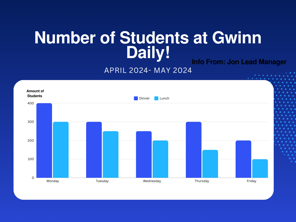
This second graph Jon gave me the numbers for how many students come to eat at Gwinn during the weekdays, and there is a difference for the dinner verses lunch times. I didn’t add the weekend information, because he said most students don’t come to Gwinn since they all travel back home or eat outside. Also fun fact Gwinn only serves breakfast all day during the weekends at times, so they don’t get that much student engagement. However from the start of the week you can see how dinner is usually very busy with a lot of students coming into to eat. Then over the week that starts to decrease, and the same thing goes for lunch as well. It is helpful for me to know this information so that I can be able to know when I should come and film clips for my video. Being able to know what time to come and film the scenery of Gwinn.
